So your chart tells you what already happened. The candle is history. Bookmap shows you why — where the real buy and sell orders are actually sitting, who’s defending a level, and the exact moment one side gives up. If you keep getting faked out right at support and resistance, this is the layer you’re missing.
I run Bookmap live on names like NVDA and TSLA every single session, right next to my DAS Level 2 and my charts. This is how I actually read it — and what that screenshot at the top of the page is showing you. Quick reminder before we go: most retail traders lose money, and this is education, not financial advice. None of this is a guarantee. It’s a way to push the odds in your favour, that’s it.
What Bookmap actually shows you
Most platforms give you a Level 2 ladder — a snapshot of resting orders, numbers refreshing so fast you can’t follow them. And here’s the real problem with that: you can’t remember. On DAS the numbers flicker, and you genuinely cannot remember what the bid looked like two minutes ago. Was there a big buyer down there? You have no idea, it already scrolled away.
That’s the whole edge of Bookmap, right? Memory. It takes that same order-book data and paints it as a heatmap over time. So you can SEE that a minute ago there was a big buyer at 99.8, and now there’s a big buyer at 100. You can see liquidity build, hold, and disappear — instead of staring at flickering numbers and guessing. That’s it. That’s the magic. Everything else is detail.
There are three things on the screen, and each one answers a different question:
- The heatmap — the coloured background. Brighter, hotter, more intense means more resting size sitting at that price. Think of it like this: a normal order is a dull colour, but a huge buyer lights up like a bright orange, almost red sun hue — it glows. That brightness IS the size. This is passive liquidity, orders waiting to get filled. It answers where are the big players parked?
- The order-book ladder (COB) — the price column on the right with the sizes next to each level. Same depth-of-market data, just in numbers, so you can read the exact size at a level.
- The trades — the bubbles and the Time & Sales feed. These are executed trades — aggression that actually hit the book. You can’t fake these. It answers who’s pulling the trigger right now?
So passive liquidity (the heatmap) versus aggressive orders (the trades) — reading the tension between those two, that’s the whole game. That’s it.
Reading the heatmap: walls, pulls and absorption
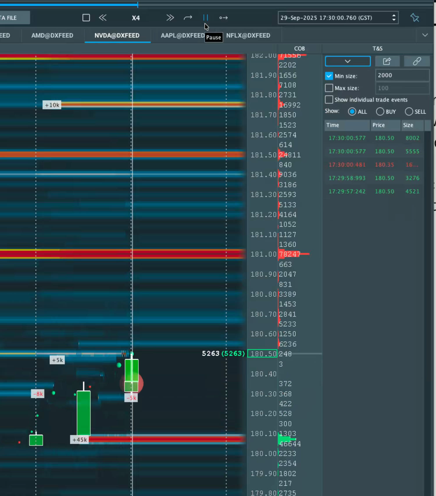
Look at the screenshot above. That bright horizontal band at $181.00 holding 78,000 shares on the ask — that’s a wall. A big resting sell order. Price has to either chew right through it or get rejected by it. There’s a second wall at $181.50 with about 25k. That’s your ceiling. Big ask = the ceiling, the resistance, the thing price has to break.
And a big bid? That’s your floor. Your safety net. But — and this is the part everyone skips — a big order by itself means absolutely nothing. A wall sitting there is just a number until it does something. So you don’t ask “is it big?” You ask: what does it DO?
Three behaviours, and they matter way more than the size:
- It holds (and gets eaten). Price hits that 78k ask over and over and can’t break it. Sellers are capping the move — until price finally absorbs the wall and chews through. That’s when it flips bullish, because the resistance just got removed.
- It pulls. The wall vanishes before price even reaches it. That’s not strength — that’s someone stepping out of the way. Price usually runs straight into the vacuum they left. A pulled wall and a broken wall look very different but both mean the same thing: that level’s gone.
- It refills. Every time it gets hit, the order comes right back. Same size, same price, back again. That’s real intent. Someone with size to fill is reloading, holding the line. That’s the one I trust most.
Now look down at the bottom of that NVDA shot. There’s a 45,000-share buyer absorbing at $180.10 — that green bubble marked +45k. Sellers kept hitting it. Hitting it, hitting it, hitting it. And price held. That’s absorption — heavy sells coming in, no reaction. Lots of action, zero reaction. And that gap, that mismatch, is exactly the thing you’re hunting for. When a level absorbs like that and the offers above start to thin out, that’s the setup: the floor is real, and the ceiling is getting weak.
The order book + Time & Sales
So the heatmap tells you WHERE the size is. The Time & Sales — the prints, on the right — tells you how fast it’s trading and which side is aggressive. Green prints lifting the offer, red prints hitting the bid.
Quick caveat, because this trips everyone up: green doesn’t mean buying and red doesn’t mean selling. There’s a buyer for every seller. The colour tells you who’s aggressive — who’s impatient, who’s lifting the offer or hitting the bid right now. That’s it.
So when you see big green prints stacking into a level that won’t drop — that’s buyers absorbing supply, eating everything the sellers throw at it. And when the tape goes quiet and the wall pulls? The move’s about to start. The heatmap is the map; the prints are the live action happening on it. You need both.
A real read: NVDA, 29 September 2025
Okay, here’s the actual read from that screenshot, start to finish:
- NVDA had a major supply zone at $180–181 — the spot it kept failing at, with heavy resting ask size sitting up there.
- That morning, a 78k ask wall sat at $181, and another 25k wall above it. That’s a lot of supply. The ceiling.
- But underneath, at $180.10, a 45k buyer kept refilling. Every single time sellers hit it, the bid came right back. Price would not break down. That’s the floor.
- And the tape? The aggression was getting absorbed. Big sells going off, no follow-through. Action with no reaction.
So the read was simple, right? Real demand defending $180, weakening supply at $181, price coiling tighter and tighter in a little breakout zone just under all-time highs. And when buyers finally pushed through that absorbed $181 wall — there was barely any liquidity left above to stop it. The ceiling was already half-eaten before price even got there.
That’s what I call Market DNA — order flow read around a technical level. And I want to be clear: Bookmap on its own is just colours on a screen. It’s not a crystal ball. But over a level you already respect, off your chart, it turns into a high-conviction read. It pushes the odds in your favour — never to 100%, nothing’s 100%, but in your favour. (More on that in order flow trading explained.)
How to actually use it (without blowing yourself up)
A few rules I trade by. Screenshot these:
- The chart picks the level, Bookmap confirms the fight. Never go hunting for trades inside the heatmap. Mark your support, your resistance, your Camarilla levels FIRST — then watch how the book behaves there. The level comes from the chart, always.
- Liquidity lies — aggression doesn’t. A big resting order can get pulled or spoofed in a second. It’s there to scare you, then it’s gone. But an executed trade already happened, it’s done, it can’t be faked. So weight what traded over what’s merely resting.
- Refill beats size. A 50k order that fills and instantly comes back is stronger than a one-off 100k that disappears. The size doesn’t impress me — the refill does. That’s the intent.
- Only on liquid names. A heatmap on a thin, low-volume ticker is meaningless. There’s no real book to read. I run Bookmap on deep names where there’s actual size sitting there.
Common mistakes
- Trading off the heatmap alone. It’s a confirmation tool, not a signal generator. No level, no trade. Simple.
- Chasing every wall. Walls pull constantly — half of them aren’t even real. Wait for price to actually interact with one and for the tape to confirm before you do anything.
- Ignoring the timeframe of the liquidity. A wall that’s been sitting there ten minutes is a very different thing from one that just popped up two seconds ago. Context matters.
- Information overload. New Bookmap users switch on every single feature and then freeze. Don’t. Start with three things: the heatmap, the ladder, the tape. That’s enough. Believe me.
Where to go next
So look — Bookmap is genuinely one of the best windows I’ve found into the fight underneath the candle. But I’ll always tell you the same thing: invest in it once you’re actually making money, or once you’ve got money to spare, because it’s not cheap. It’s an expensive tool. Don’t run out and buy it on day one.
The good news — for you guys, we’ve got an affiliation with Bookmap, so you can try it out for fairly cheap before you commit to anything. And here’s the honest part: it’s optional. You don’t actually NEED it. You can spot every single one of these things — the walls, the absorption, the refills, the floors and ceilings — on DAS Data Pro or Thinkorswim too. It’s just harder, because you don’t get the memory. So try it, see if the heatmap clicks for the way your brain works, and don’t spend the money until it does.
If you’re still deciding, I wrote an honest is Bookmap worth it? breakdown. If you’ve already got it and the screen just looks like noise, start with my best Bookmap settings for day trading. And to understand the bigger skill this all sits inside, read order flow trading explained.
Bookmap won’t make you a trader, right? Nothing will do that for you. But once you can read price action and your levels, it’s the clearest window I’ve found into the fight happening underneath the candle — and that fight is where the edge is. Watch this read two or three times, go pull up NVDA or TSLA, and start turning these names into your family.